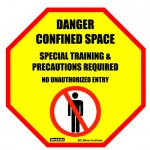
A confined space warning sign from WorkSafeBC
It takes the right symbols, formatting, and colour coding. Effective signs must also be the right size for workers to read them from specific viewing distances.
“If signs are not noticed, they won’t convey their potentially life-saving messages,” says Geoffrey Peckham, who studies semiotics – the science behind how people interpret signs.
Peckham and his team contributed to new standards for safety signage based on “principles derived from human factors research on how people comply with visual messages,” reads Curbing Forklift Hazards, his recent post in OHSOnline.com.
“When it comes to mitigating risk and going about your work in the safest way possible, there are new methods for communicating risk that provide us with better ways to warn than the status quo found in most warehouses and facilities,” reads the post.
“Most safety signs in place in facilities today communicate partial information… The new systems give management an important tool for warning people about potential risks and hazards so they can make good decisions to avoid accidents and injuries.”
Standards for safety signs
Safety signs should follow CAN/CSA Z321-96 Standard Signs and Symbols in the Workplace, says the WorkSafeBC Human Factors Bulletin Effectiveness of signage.
The standard, written in 1996, is no longer mandated, but it’s still used widely. Its symbols are familiar and used in other standards worldwide – like the red circle with a line through it that indicates prohibition, for example.
Have you seen any safety signage improve at your workplace lately? Do tell.
Note: Minor revisions were made October 15, 2012.


That is true, what makes a good safety sign is ensuring that it works: it is seen from a needed distance, it is understood, and, most importantly, it saves lives. That’s a great summary of what it takes to call one’s safety signs effective.
One way to make your signage more effective is to “personalize it”. Generic signs can fade into the background, personalized signs specific to a production area, featuring the actual workers in the sign or perhaps their families as reminders of why they need to “worksafe” can bring these messages gently to the forefront of their consciousness. Here is an example.
http://www.accuform.com/store/virtual_catalog/catalog_large.cfm?printPageOn=1&vcID=20&submit=processing
Appreciation to my father who shared with me concerning this blog,
this blog is in fact amazing.
Often too many signs can be the culprit in overwhelming people on jobsites or offices – especially untrained/infrequent visitors.
In respect to increased worker awareness for personal safety and emergency action planning that is recognized both on and off the job, companies might consider utilizing the ICE (In Case of Emergency)symbol that was specifically designed by safety professionals to attract immediate attention and convey a message where safety information or equipment is located. You can download and use the symbol non-commercially for free at ice4safety.com